Mobile-First Design for Groomers: 73% of Your Clients Are on Their Phone
Here's a stat that should change how you think about your website: 73% of people searching for dog grooming do it on their phone. Not at a desk. Not on a laptop. On their phone — probably while sitting on the couch with their dog who desperately needs a bath.
If your website was designed desktop-first (which most are), you're giving the worst experience to your biggest audience.
What Mobile Visitors Actually Do
Mobile grooming searches follow a predictable pattern:
- Search "dog grooming near me" or "dog groomer [city]"
- Look at Map Pack results (Google Business Profile)
- Click through to 1-2 websites to compare
- Look for pricing and availability
- Either tap to call or bounce within 15 seconds
That's your window: 15 seconds. If your site hasn't loaded, shown pricing, and presented a clear way to book within 15 seconds, you've lost them to the next result.
Speed: The Non-Negotiable
Page speed isn't a nice-to-have — it's a conversion factor and a ranking factor.
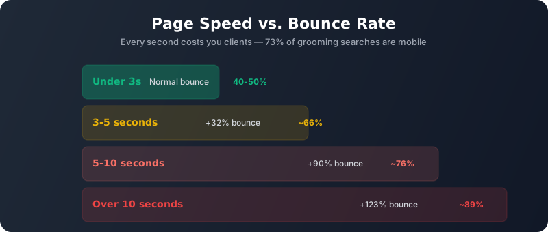
- Under 3 seconds: Normal bounce rate (40-50%)
- 3-5 seconds: Bounce rate increases 32%
- 5-10 seconds: Bounce rate increases 90%
- Over 10 seconds: 123% bounce rate increase — you're paying for clicks that never see your content
Speed killers for grooming sites:
- Unoptimized hero images — A 4MB full-width photo takes 8+ seconds on cellular. Compress to under 200KB.
- Too many plugins — Every WordPress plugin adds JavaScript that loads on every page. 20+ plugins = slow.
- No caching — Without server-side caching, your site rebuilds from scratch for every visitor.
- Embedded videos on homepage — YouTube/Vimeo embeds add 2-3 seconds. Use a thumbnail with play button instead.
- Custom fonts loading slowly — Use system fonts or preload your font files.
Test your speed: Go to Google PageSpeed Insights, enter your URL, and look at the mobile score. Above 90 is excellent. 50-89 needs work. Below 50 is actively hurting your business.
Thumb-Friendly Design
People browse with one thumb. Design for it:
- All buttons minimum 48px tall — Anything smaller is frustrating to tap accurately
- Space between clickable elements — At least 8px gap so people don't accidentally tap the wrong thing
- Important actions in thumb reach — The bottom half and center of the screen are easiest to reach with a thumb. Put your CTA buttons there.
- Sticky call button — A fixed "Call Now" button that stays visible as they scroll. This alone can increase phone calls 20-30%.
Content Hierarchy for Mobile
On desktop, you have a wide canvas. On mobile, everything stacks vertically. The order matters:
- Logo + phone number (header, always visible)
- Headline: "Dog Grooming in [City]" — confirms they're in the right place
- Primary CTA: "Book Now" or "Call to Book" button
- Key differentiator: One sentence — "Same-day appointments available" or "Open 7 days"
- Social proof: "4.9 stars, 150+ Google reviews"
- Services with pricing (scrollable section)
- Before/after gallery
- About/trust section
- Footer with address, hours, secondary CTA
Notice what's NOT in the first scroll: your team's life stories, your salon's founding history, or a blog feed. Those can exist on the page, but they belong below the conversion-critical elements.
Mobile Forms That Don't Suck
If you have an online booking form, here's how to keep mobile users from abandoning it:
- Maximum 4-5 fields — Name, phone, dog name, preferred date/time. Everything else is optional or can happen at check-in.
- Large input fields — Full-width on mobile, tall enough to tap easily
- Correct input types — Phone fields should trigger the number keyboard, email fields trigger the email keyboard
- No dropdowns with 50+ options — If you need breed selection, use a search/autocomplete field instead
- Show progress — If it's multi-step, show "Step 1 of 3"
- Error messages inline — Don't wait until they tap "Submit" to tell them their phone number is wrong. Validate as they type.
Is your website losing mobile visitors? We build mobile-first grooming sites that load fast and convert.
Get a Free Mobile AuditThe Bottom Line
Mobile-first isn't a design trend — it's how 3 out of 4 potential clients experience your business for the first time. A site that looks amazing on a 27-inch monitor but loads slowly and frustrates on a phone is actively costing you clients every day.
The fix doesn't require a full redesign. Start with speed (compress images, remove unused plugins), then fix the CTA visibility (sticky call button, book button above the fold), then tackle the form experience. These three changes alone can increase mobile conversions 30-50%.